Painting Industrial & Commercial Environments to Enhance Safety

Thoughtful, vigilant painting can help facilitate a safe, standardized environment for all employees, visiting customers, and supplier partners alike.

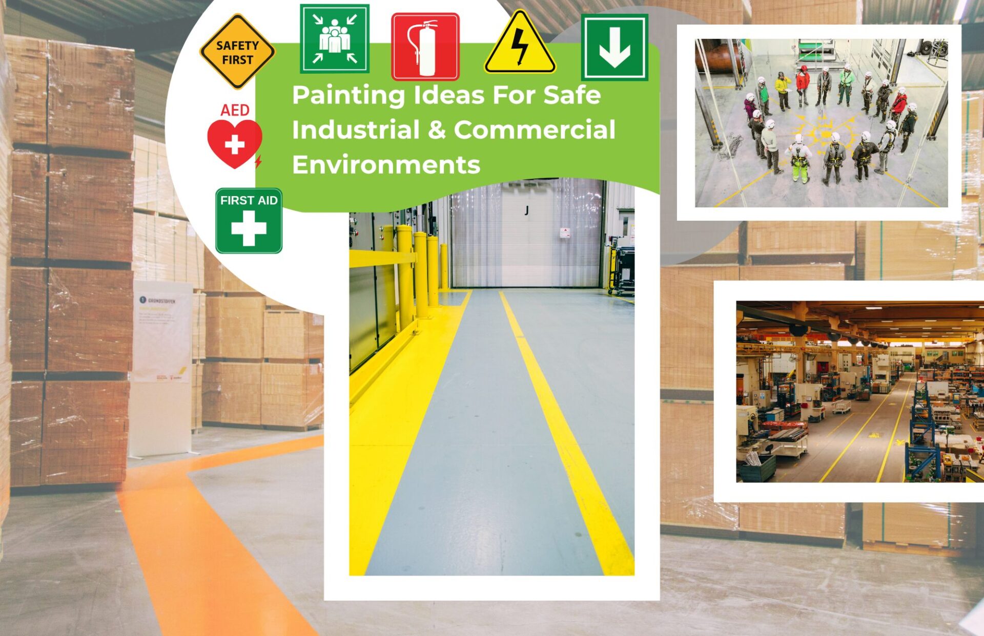
Applying highly visual, well-planned color combinations & risk-mitigating designations ─ whether on your manufacturing floor, a warehouse & distribution center, around large commercial properties, or even school areas ─ guide the right behaviors and help support a safer environment. Some paint-driven facility safety ideas include:

Color Code Hazards and Safety Zones – use standardized colors to immediately convey potential risk areas such as:

  • Yellow = caution, physical hazards, trip and fall areas
  • Red = fire equipment, emergency stops, prohibited actions
  • Orange = dangerous machine parts or energized equipment
  • Green = safety equipment, first-aid stations, safe areas, or muster points
  • Blue = informational or mandatory-action areas
  • Black & White or Yellow & Black Striping = boundaries and physical hazards

Safe Walking Zones – use paint to designate where people are expected to safely walk without the risk of forklifts, rolling equipment, or hand trucks running into them. An example of using colors to designate status could look like:

  • Yellow lines = pedestrian boundary
  • White lines = designated walkway
  • Crosswalk markings = controlled crossing points

Forklift and Equipment Exclusion Zones – define areas where employees should not stand or where equipment should not be parked. Yellow & black or red & black combinations work well for marking off these types of areas. Some examples include:

  • Forklift operating zones
  • Crane swing areas
  • Loading & unloading areas
  • Electrical panels
  • Machinery borders
  • Material staging areas

Emergency Equipment Areas – brightly painted floor boxes or wall areas can quickly and consistently draw attention to:

  • Fire extinguishers
  • Fire hoses
  • Automated External Defibrillators (AEDs)
  • First-aid stations
  • Emergency showers
  • Eyewash stations
  • Emergency exits

Stairs and Steps Visibility – use high-visibility paint or contrasting markings on:

  • Stair nosings
  • First and last steps
  • Handrail areas
  • Stairwell floors

Changes in Floor Elevation – paint can make otherwise subtle tripping hazards much more apparent. Some potential applications include:

  • Ramps
  • Loading docks
  • Platform edges
  • Pits
  • Changes in floor elevation

Safe Standing Areas Plus Visibility Around Machinery – contrasting paint colors can make machinery and its various areas of functionality easier to see. Some ideas include:

  • Machine footprints
  • Operator stations
  • Maintenance zones
  • Moving-equipment clearance areas
  • Restricted-access areas

6S (Safety, Sort, Shine, Set in Order, Sustain, Standardize) and Tool Shadow Boards Implementations – paint is particularly useful as part of a 6S workplace organization program. Instead of simply telling employees where something belongs, the floor and tool shadow boards visually define its home – and make it obvious to all when a tool or piece of equipment is missing.

One-Way Traffic Flow Reinforcement – painted arrows can establish traffic patterns for:

  • Forklifts
  • Tugger trains
  • Carts
  • Delivery vehicles
  • Pedestrians

Please contact Trusted Coatings Contact TC to learn more about ways we use our commercial painting prowess to make your Central Ohio work environment safer for all employees, suppliers, and customers. Thanks for reading!

Ten Moods from Interior Colors

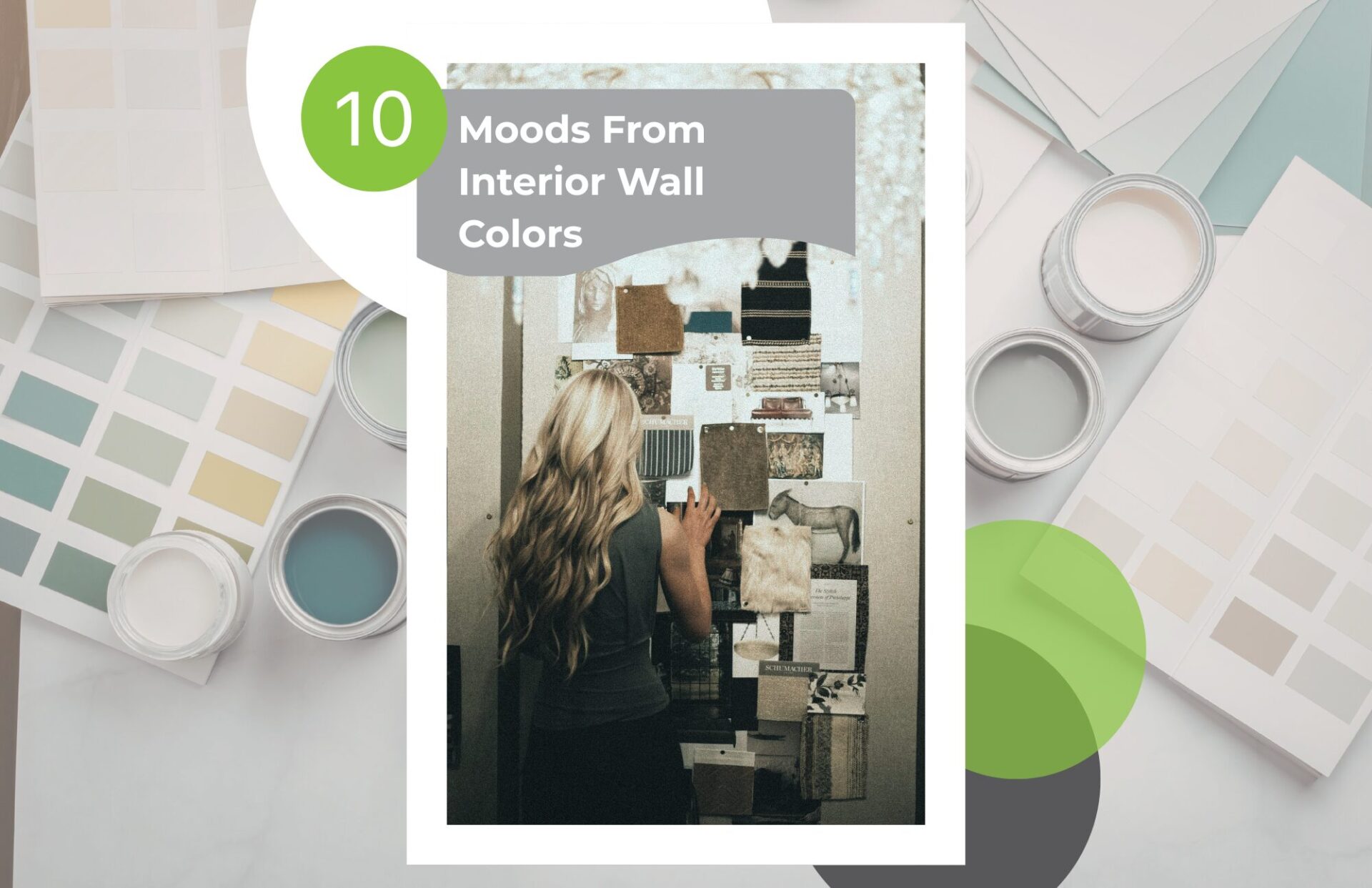
Interior wall colors play an outsized role in shaping the ambiance of a room – with emotional impact akin to well-placed lighting or interesting design elements, and not too far behind the ultimate tone setter…music. Here are ten moods commonly created through interior paint color choices along with several suggestions of colors that can evoke them:

1. Calm and Serene

Soft, muted tones help slow the mind’s racing thoughts and reduce visual stimulation. Think of recurring shades found in Nature. These tone types are excellent choices to add serenity to bedrooms, spas, home yoga studios, and meditation spaces.

Affirming color choices: pale blues, soft sage green, light gray, dusty lavender

2. Warm and Cozy

Warmer hues make a room feel intimate and comfortable. These smoldering, dusty tones are often used in living rooms, dens, and reading spaces to create an organic, grounded atmosphere.

Affirming color choices: warm beige, terracotta, camel, soft caramel browns

3. Energetic and Stimulating

More vibrant colors can increase a room’s intensity and visual energy – quickly catching the viewer’s gaze and amping up excitement levels. These daring colors are good for kitchens, creative studios, children’s playrooms, or gyms.

Affirming color choices: bright yellow, coral, tangerine, bold red accents

4. Sophisticated and Elegant

Deep, controlled colors create a refined, polished feel. Popular in dining rooms, libraries, home bars, or offices – essentially rooms aspiring to convey a more formal, vintage, classical mood.

Affirming color choices: charcoal, navy, deep emerald, rich burgundy, gold

5. Open and Airy

Colors that reflect light tend to make spaces feel bigger and brighter. These tones create a crisp & clean aesthetic and are often applied very effectively in smaller rooms or more modern interiors.

Affirming color choices: crisp white, pale gray, soft cream, very light blue

6. Earthy and Grounded

Natural colors connect a space to our beloved Central Ohio’s Great Outdoors. These down-to-earth, terrain-affirming tones work well in rustic settings, strategically neutral atmospheres, and Nature-inspired homes.

Affirming color choices: olive green, clay, sand, stone gray

7. Playful and Cheerful

Bright or unexpected colors are fantastic for reinforcing a fun, spontaneous atmosphere – perhaps, even invoking a sense of being on vacation in a tropical paradise. The levity created by these colors adds some joy to kids’ rooms, music rooms, basement bars, dance areas, or other creative spaces.

Affirming color choices: turquoise, lemon yellow, bubblegum pink, bright teal

8. Dramatic and Moody

Dark colors create intensity and visual depth. Be forewarned: a little darkness goes a long way, and these powerful tones can make the area feel smaller. These intense colors are often used on accent walls, home coffee & bar areas, formal dining rooms, media rooms (or your Goth Teenager’s bedroom, hey, why not?).

Affirming color choices: black, deep plum, dark navy, forest green, crimson red

9. Clean and Minimal

Simple palettes emphasize clarity and order. These subtle, quite versatile, neutral tones are typical of modern or Scandinavian-style interiors. They also work very well in small, confined spaces that need diligent cleaning like bathrooms, cat box areas, dog washing stations, and laundry rooms.

Affirming color choices: pure white, cool gray, soft greige (blend of gray and beige)

10. Luxurious and Intense

Highly saturated colors or jewel tones create a sense of richness. These work exceedingly well with velvet, brass, or dark wood accents.

Affirming color choices: sapphire blue, ruby red, emerald green, amethyst purple

Let’s end this TC Blog post on a design trick: The same color family can create different moods depending on saturation and darkness. For example, moods elicited by a continuum of blue saturation: light blue is calming while bright blue is energetic, and dark blue adds sophistication.

We hope this toe-dip into mood-inducing colors is helpful for your next project. When you’re ready to get help creating some ambiance for your own interiors, please say the word: Contact Trusted Coatings

FOR THE BEST PAINTING SERVICES IN THE COLUMBUS, OHIO AREA

HOW CAN WE HELP YOU BECOME THE NEXT TRUSTED CUSTOMER?

Here at Trusted Coatings we recognize that we are in the service business, and everything we do is designed to put you first. We are dedicated to delivering the best customer experience imaginable, and whether you are a homeowner or general contractor we will earn the privilege to be called Trusted every day!